Here are some very fresh looking graphic and packaging / brand creations from the New Zealand based…
Valvemaster
Brand identity, product and packaging
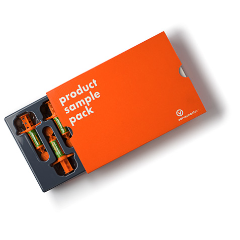
pHd3 created a brand to instill confidence in the lead substitute product, both to trade and end users.
The scope of the project extended to applicator, dispensing bottle, packaging, labeling, point of sale and support material, all deploying the distinctive Valvemaster orange.
“To me the greatest challenge was to cut through the ‘noise’ in the retail environment.
I believe we have been very successful in achieving this demanding goal.”
Lloyd Williams, Director.
Merlin Remote Openers
Identity
Merlin required a new brand identity to better fit with its range of products, most particularly the remote controllers designed by pHd3. The brand had to work across a variety of applications and clearly differentiate Merlin in both domestic and export markets.
The vibrant green remote control ‘finger on the button’ is a potent symbol for Merlin.
Albedo vfx
Brand identity
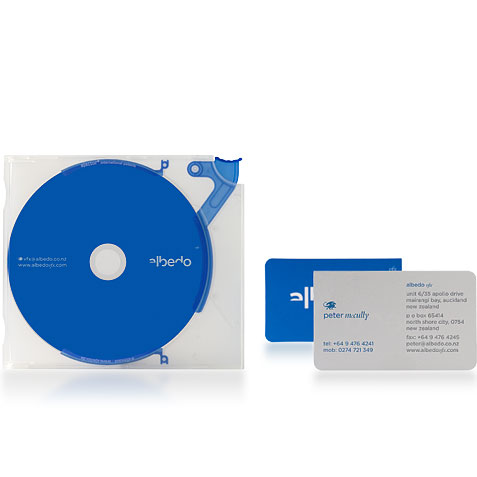
Albedo vfx, a visual effects company in Auckland, planned to increase their international profile and differentiate themselves from their competitors.
The Albedo vfx mark has a dynamic, animated quality, suggesting that the letters are in the process of being ‘animated’. The saturated blue is borrowed from the ‘blue screen’ (part of the visual effects toolkit). A dragon acts as a supporting mark, hinting at the mysterious and fantastical nature of the visual effects world.
More of this groups work at:
http://www.phd3.co.nz/index.html
dragon lake, siberia.


Comments on this entry are closed.